Accounting Firm Responsive Website (Case Study)
Role: UX Visual Designer (Webflow)
Client: Morrison & Morrison, LTD.
Challenge
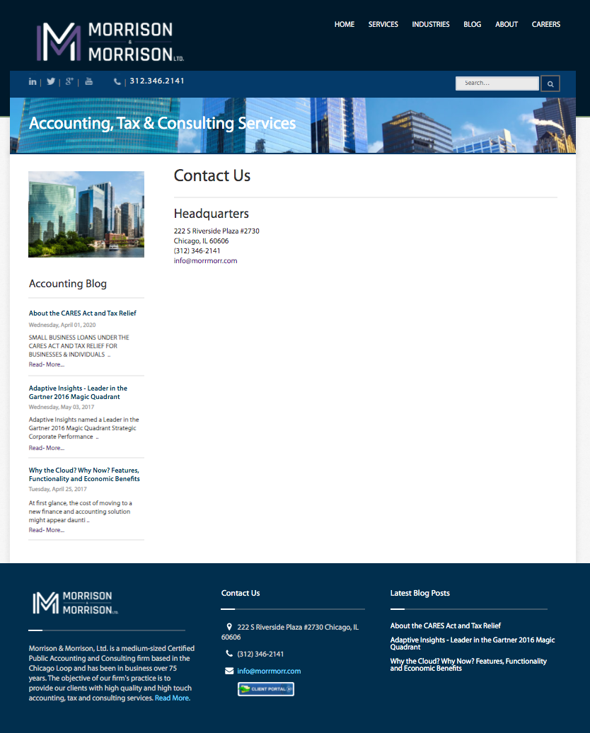
Morrison & Morrison, Ltd., an accounting, tax, and consulting firm, needed a website redesign after 20+ years on an outdated CMS, which was being discontinued by year-end. With no dedicated creative team, IT handled infrequent updates. I was hired as an administrative assistant with an interest in UX design and tasked with delivering a new site on a small budget and tight deadline.
The Ask
Design a user-friendly website on a platform that allows non-technical stakeholders, such as the IT department, to easily maintain and update content post-launch with minimal effort and no coding knowledge.
User Personas
Retired High-Net-Worth Clients
Name: John, the Retired Executive
Age: 65+
Occupation: Retired Executive, Business Owner, or Professional
Location: Typically suburban or affluent urban areas
Tech Proficiency: Basic to Moderate
Age: 65+
Occupation: Retired Executive, Business Owner, or Professional
Location: Typically suburban or affluent urban areas
Tech Proficiency: Basic to Moderate
Goals:
- Accessing tax and accounting information with ease.
- Managing wealth and consulting services.
- Staying connected with their financial advisors.
- Ensuring seamless navigation, as they are used to the old website layout.
Pain Points:
- Prefers familiarity and consistency; changes can feel overwhelming.
- Less patient with new technology or complex interfaces.
- Security concerns about online access to financial data.
- Requires clear, concise content and strong customer support.
Next-Generation Clients (Secondary Audience)
Name: Emily, the Wealth Management Beneficiary
Age: 45-60
Occupation: Mid-career professional, often in a high-income bracket
Location: Urban/suburban, typically located in areas with a high concentration of professionals
Tech Proficiency: Moderate to High
Age: 45-60
Occupation: Mid-career professional, often in a high-income bracket
Location: Urban/suburban, typically located in areas with a high concentration of professionals
Tech Proficiency: Moderate to High
Goals:
- Engaging with wealth management and investment services.
- Gaining easy access to financial advice and information.
- Interested in transparent communication and ongoing collaboration with advisors.
- Seeking educational resources and tools to better manage finances.
Pain Points:
- Frustrated with overly complicated or outdated systems.
- Concerned with security but also looking for modern solutions.
- Wants access to financial tools and resources, like calculators, blogs, or tax tips.
Prepared Wireframes & Lo-Fi Prototype
Sketched out wireframes on pieces on paper (not pictured) and showcased stakeholders the progress of the development by identifying the user journey in a lo-fi prototype.
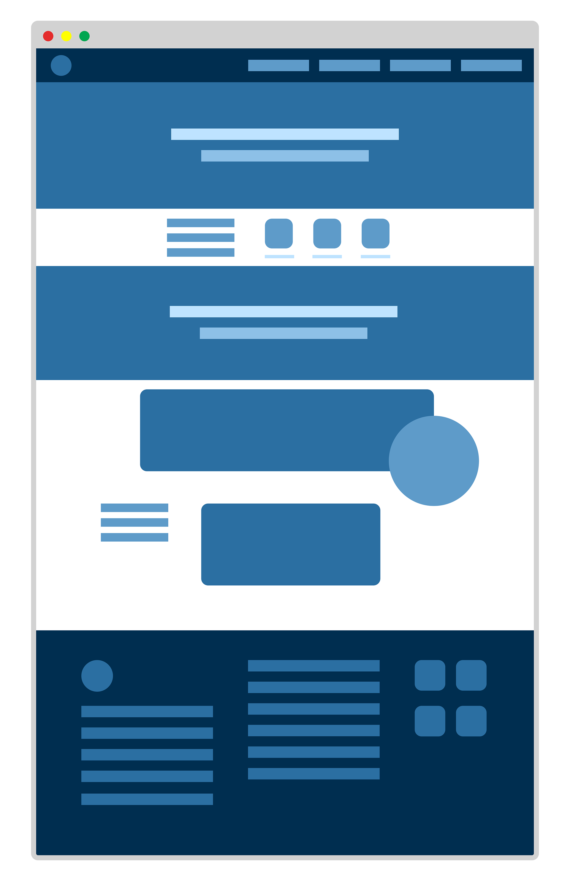
Home Page
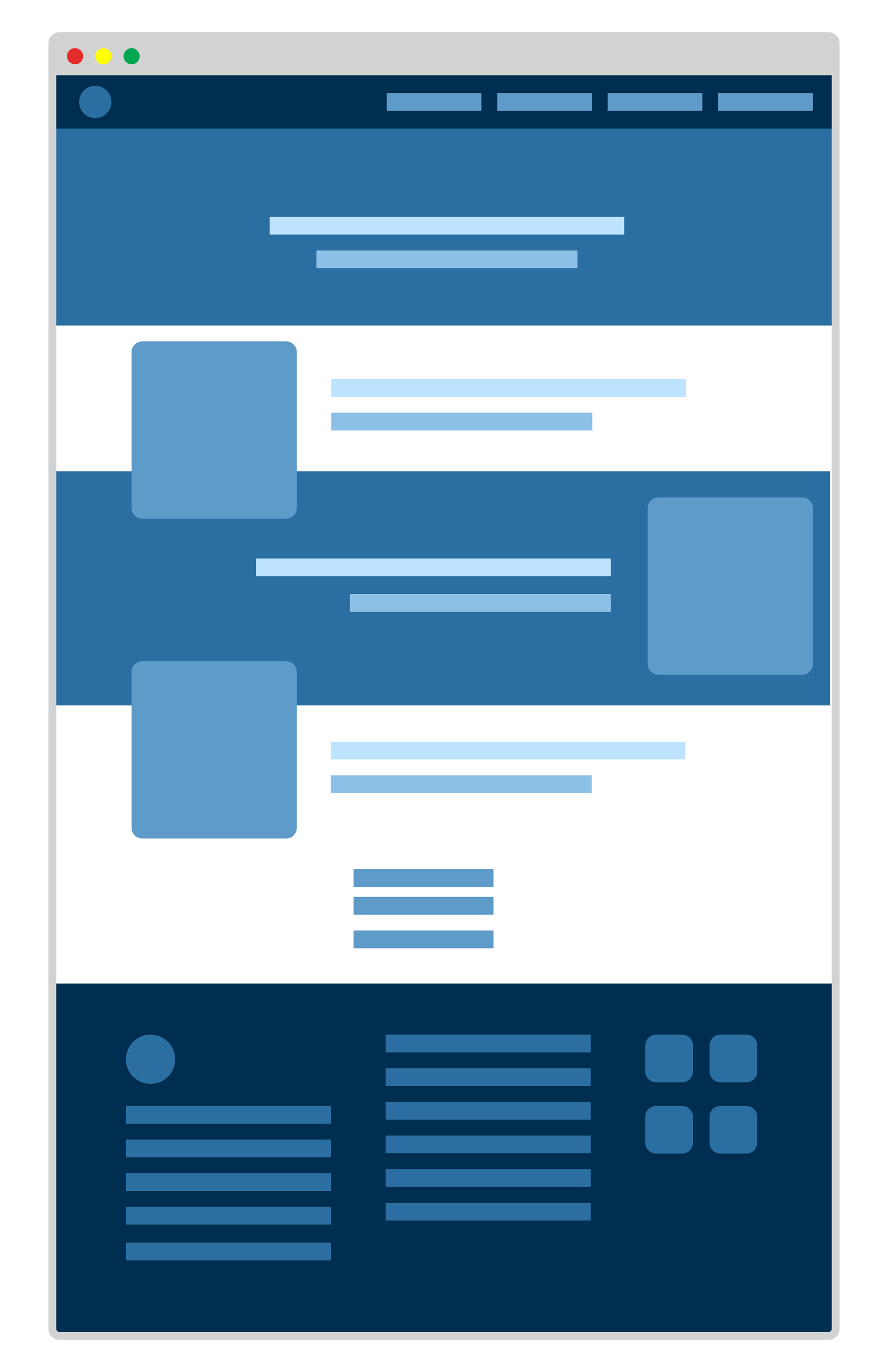
Services Page 1
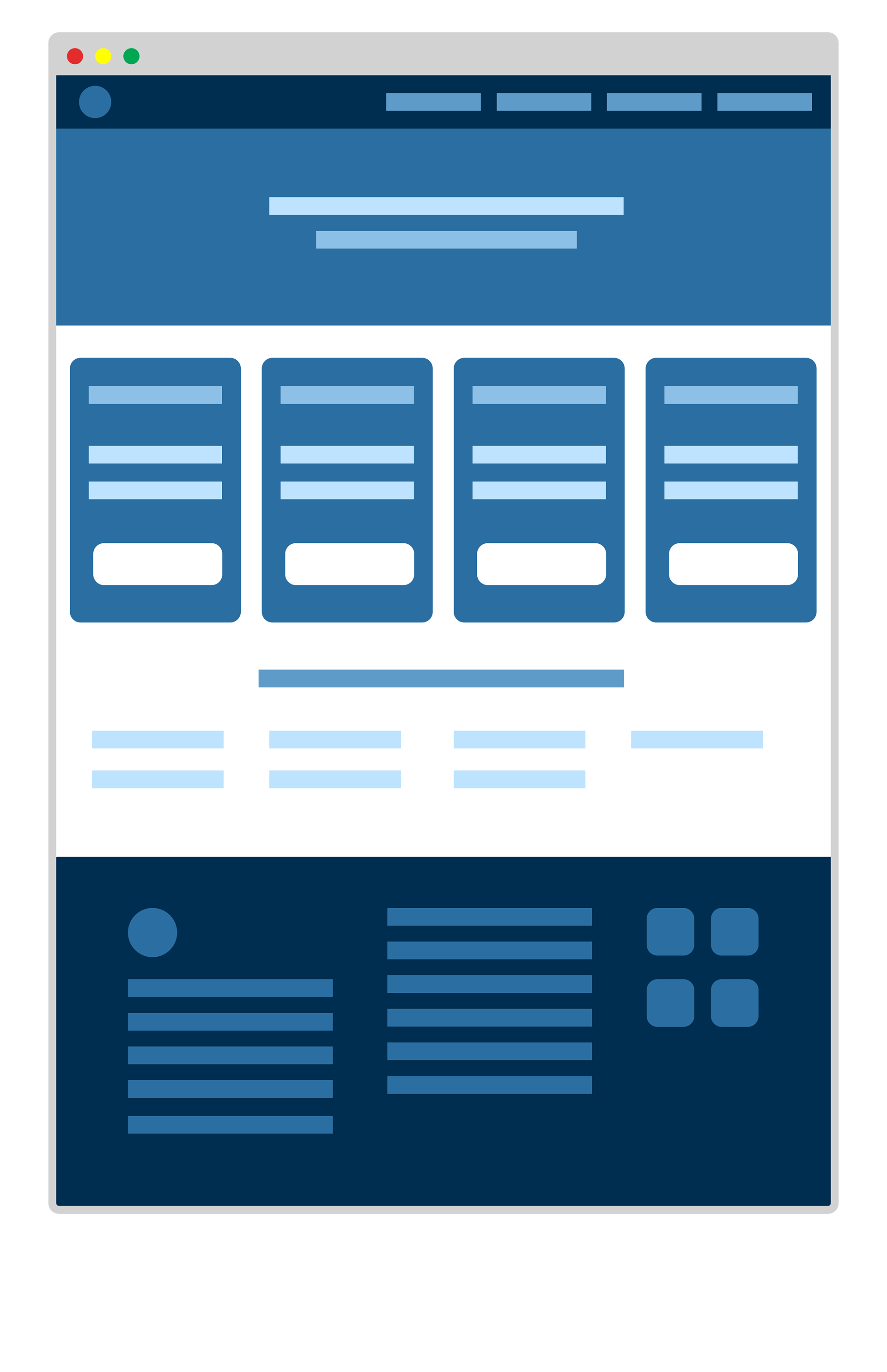
Services Page 2
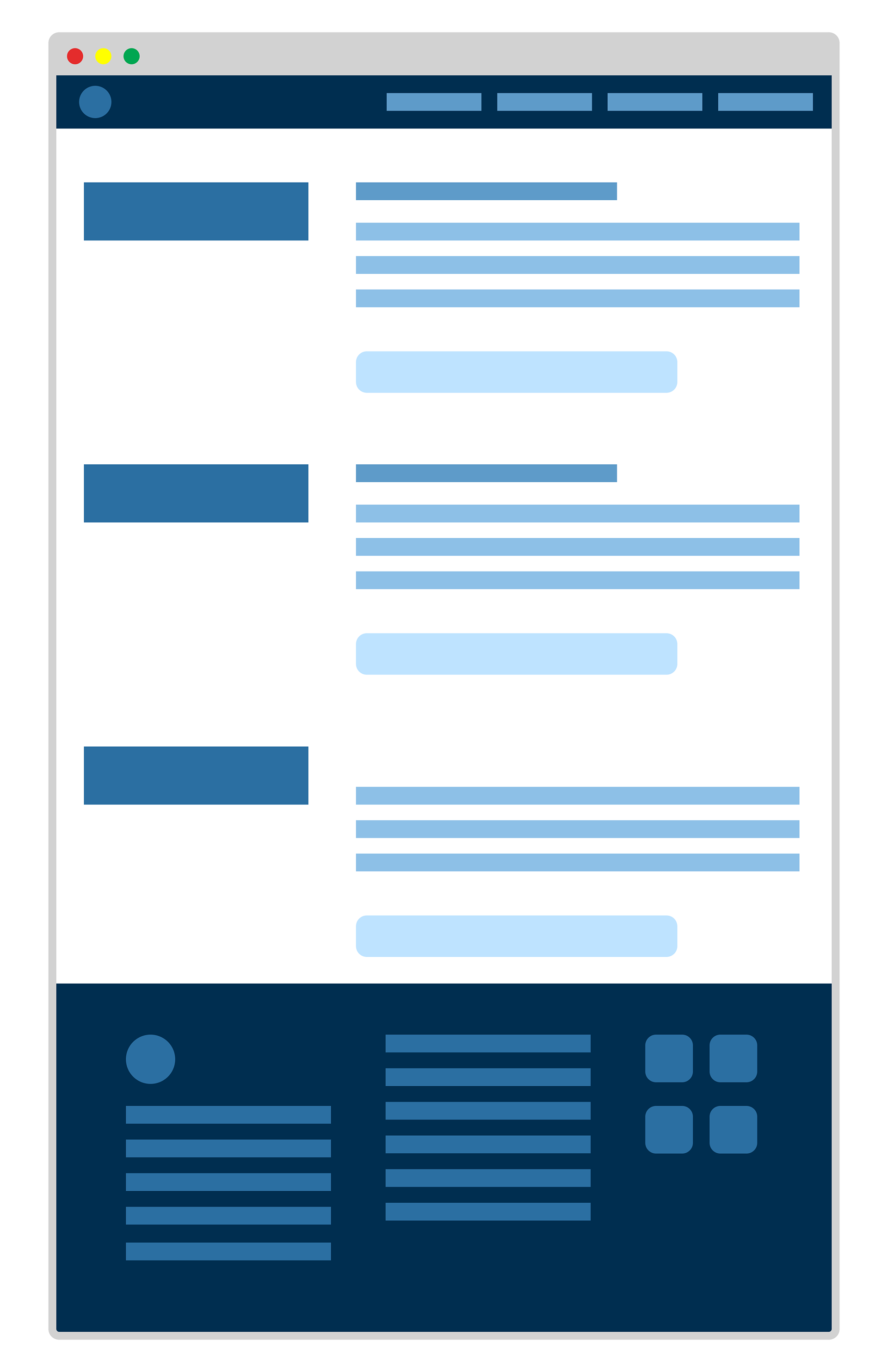
Services Page 3

Industries Page
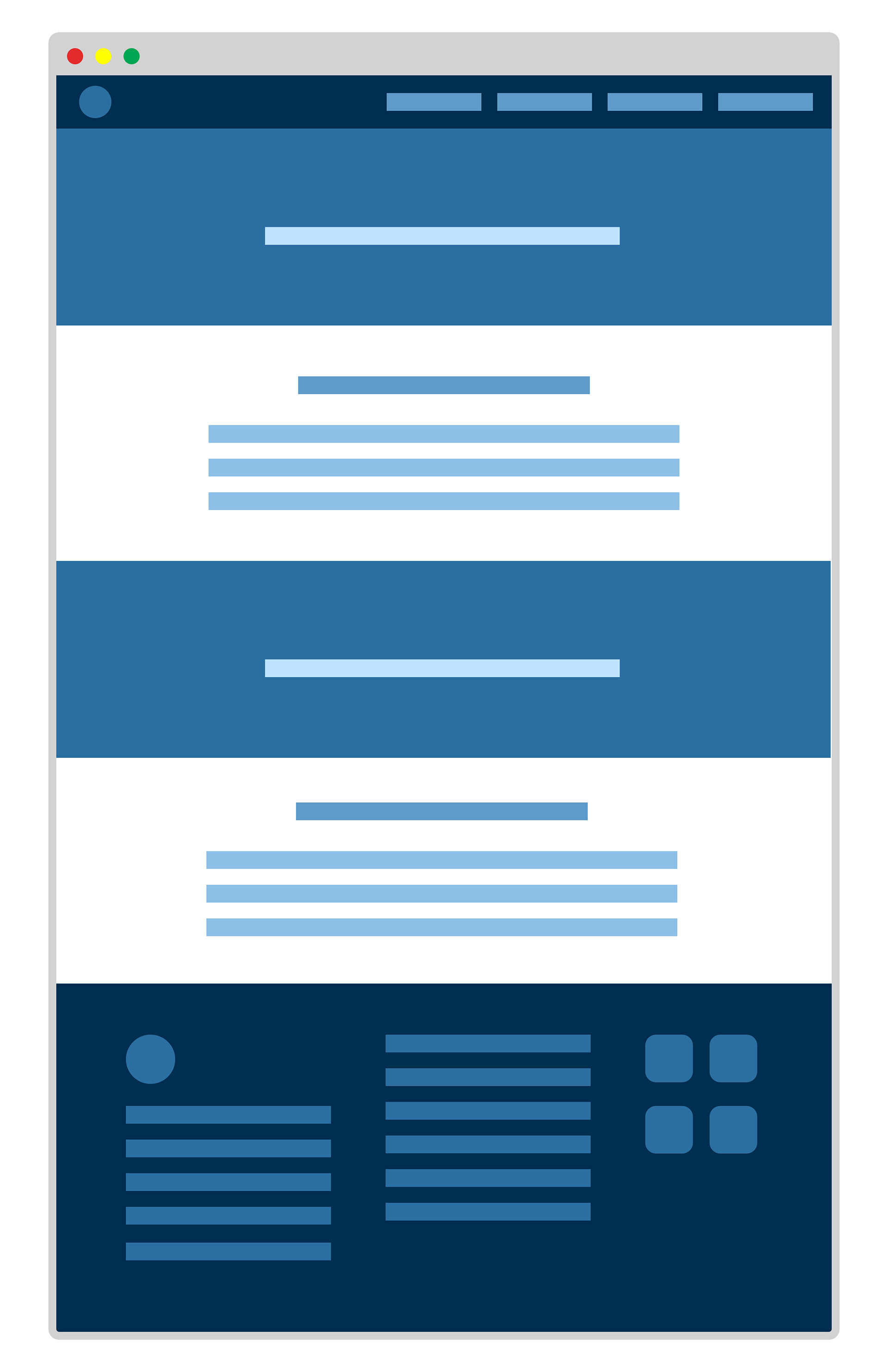
About Page
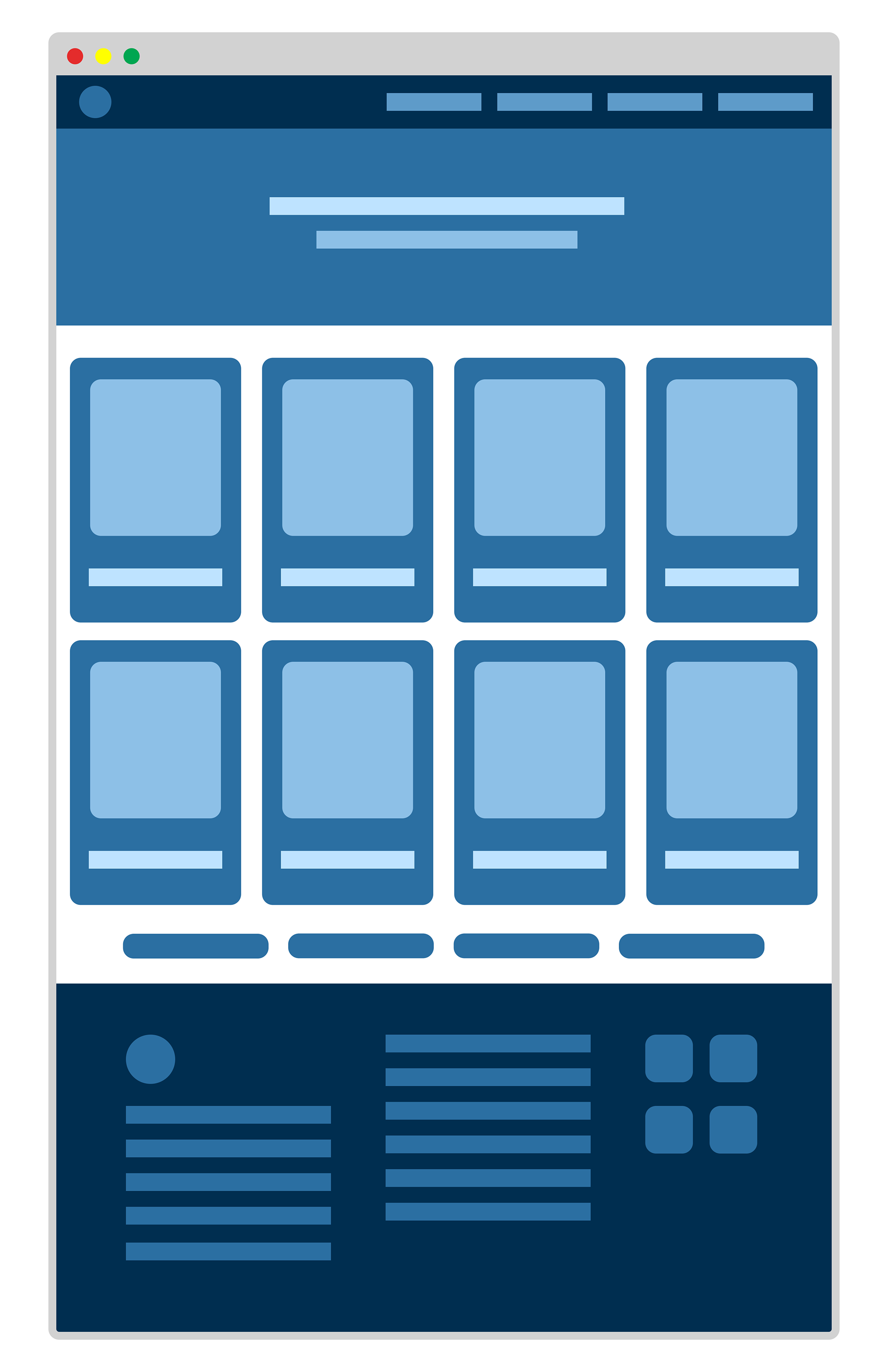
Leadership Page 1
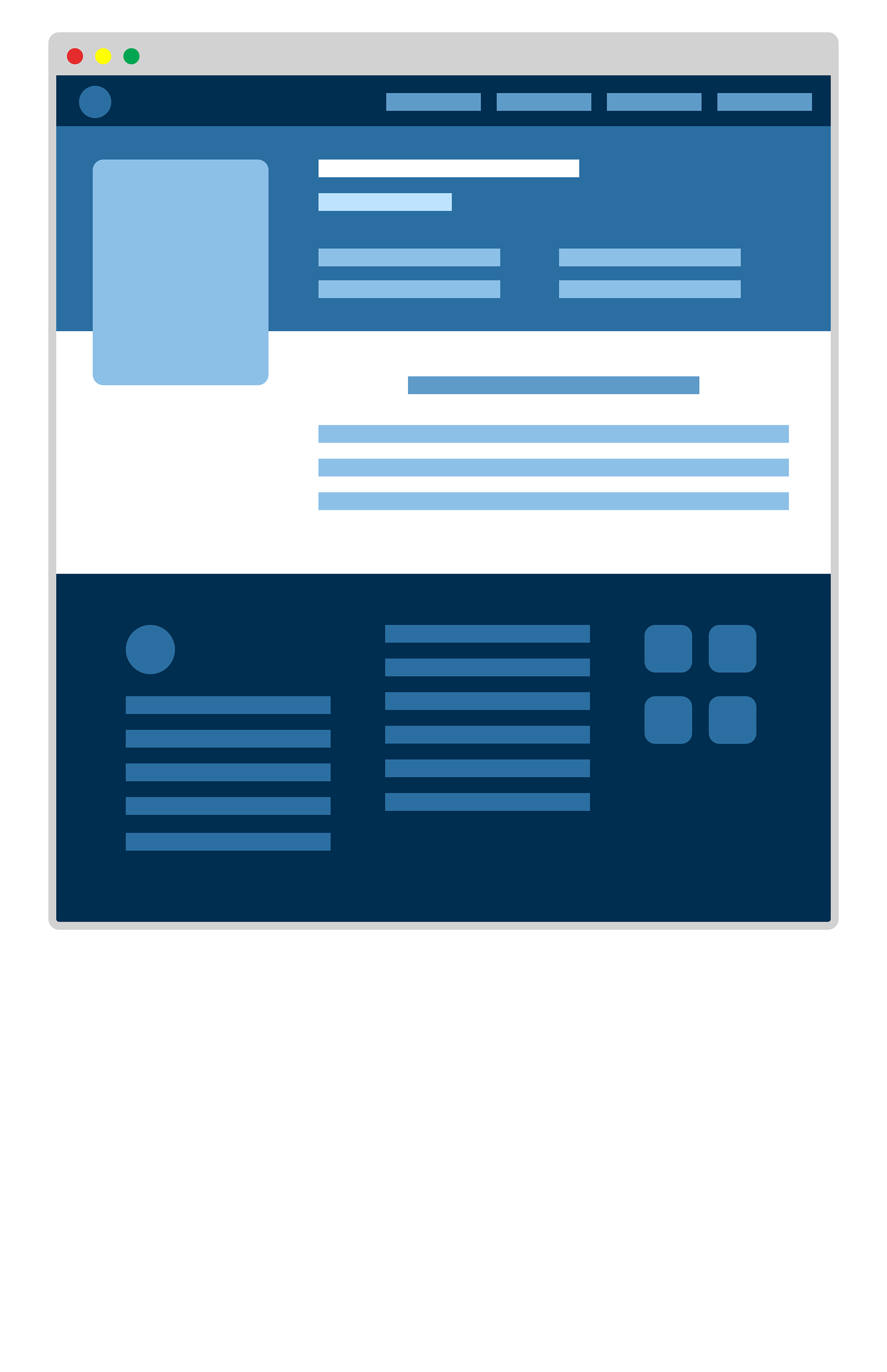
Leadership Page 2
Wireframe and Lo-Fi Prototype Presentation
Outcome
Without the time limit I had and resources, I went straight from building the Lo-Fidelity prototype, skipping the user research, and into the visual design on Webflow. After many conversations with stakeholders and revisions, the stakeholders gave the green light to publish the 50+ page site. I soon joined CDW as a Digital Content Specialist and I was unable to track the analytics of the site. Below are snapshots of the Morrison & Morrison, ltd. site and interactive features.
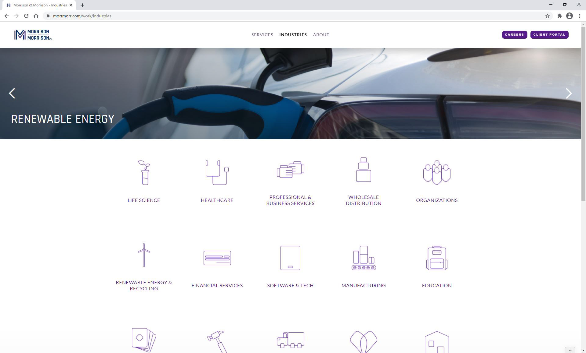
Industries
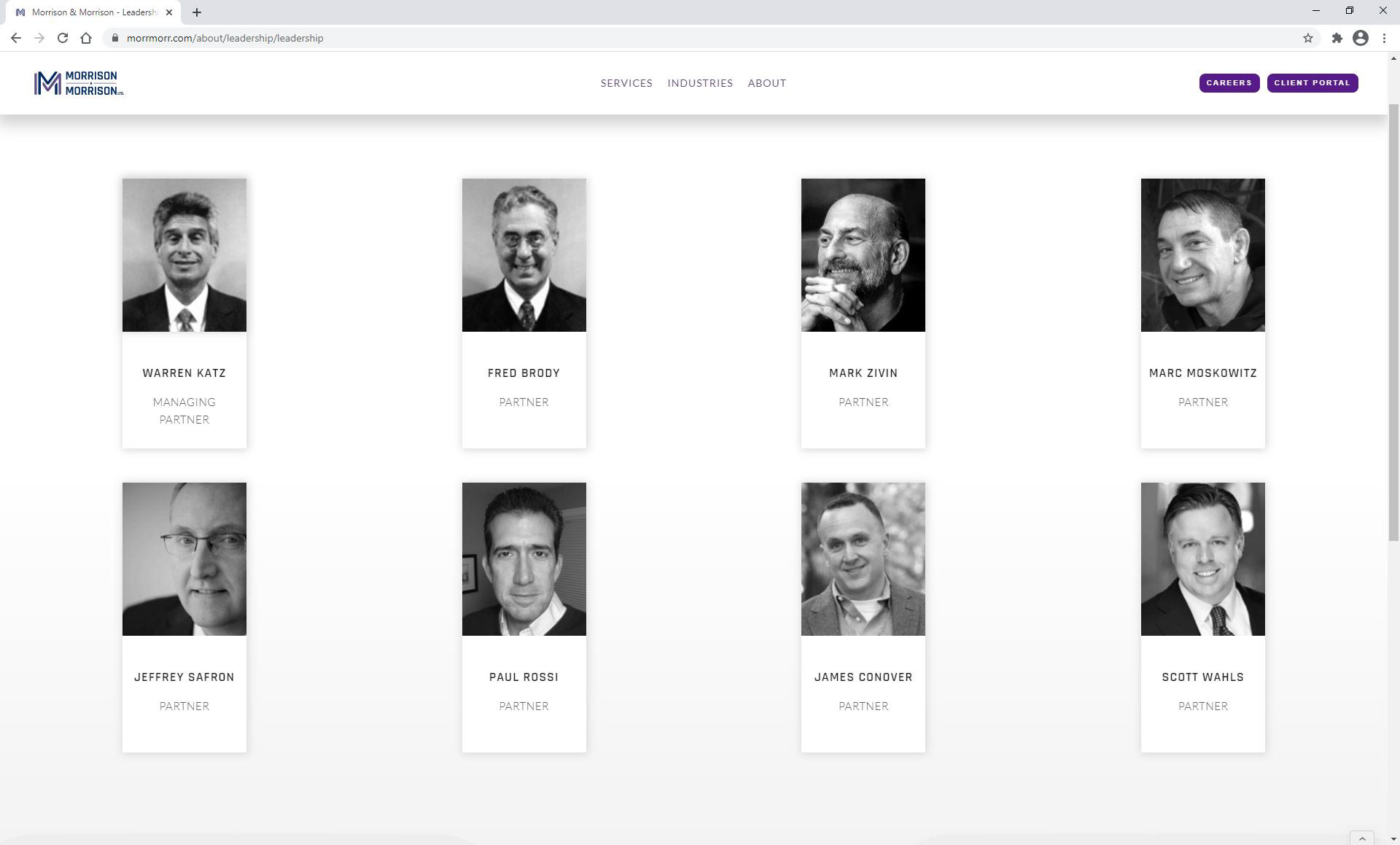
Leadership
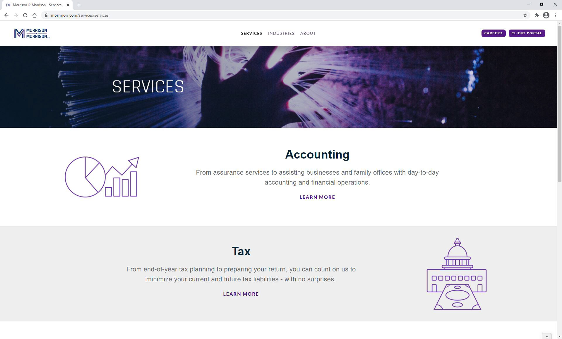
Services
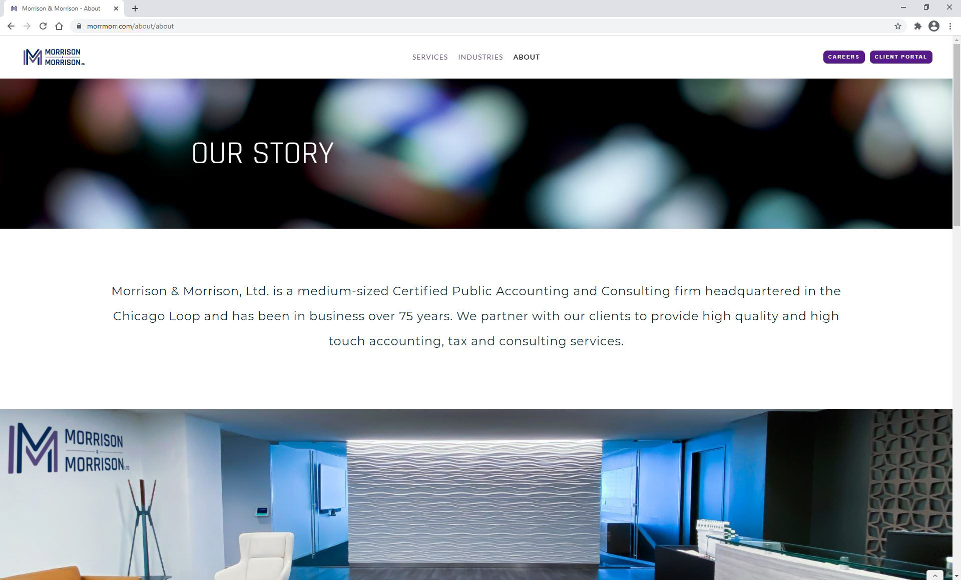
About
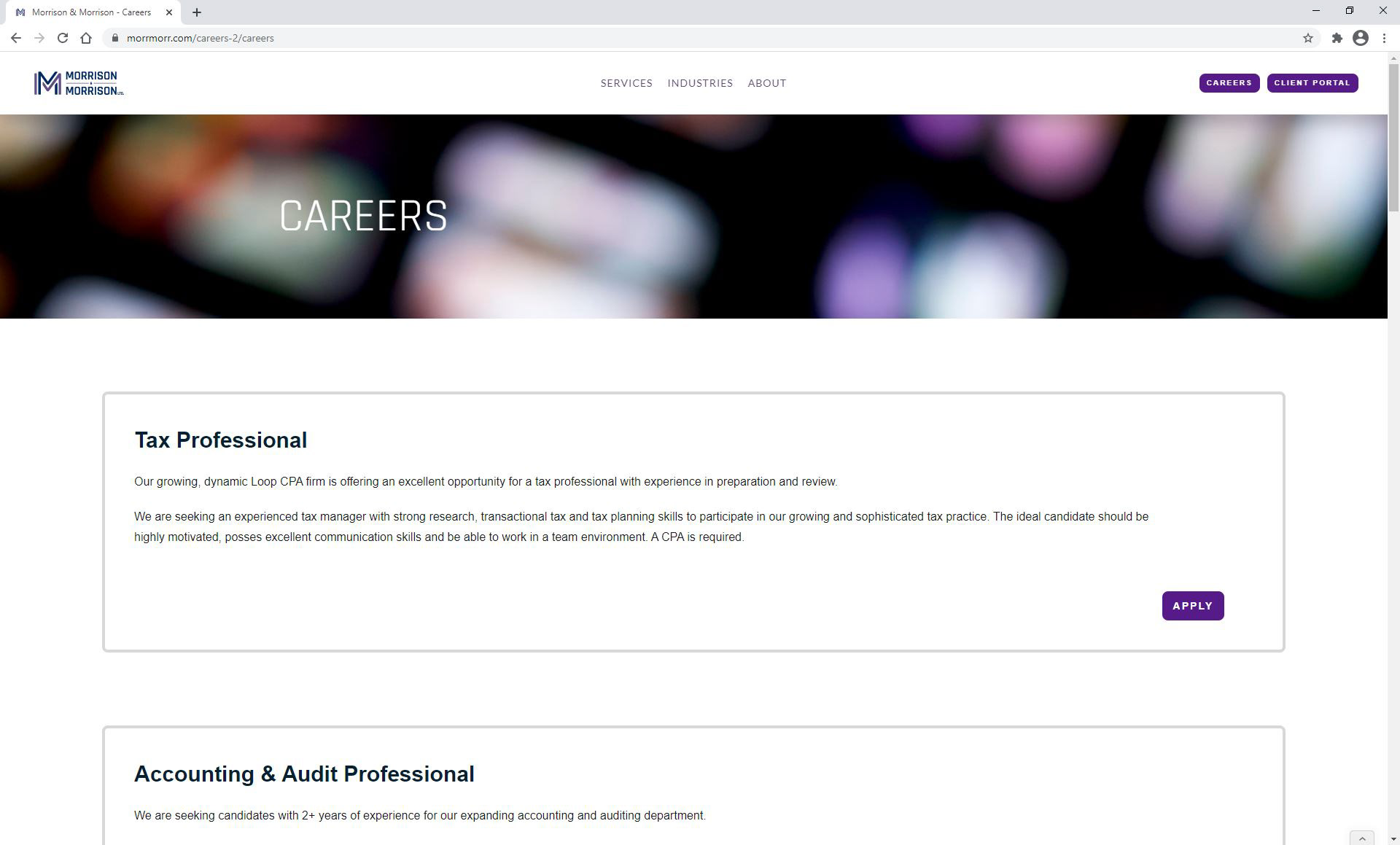
Careeers
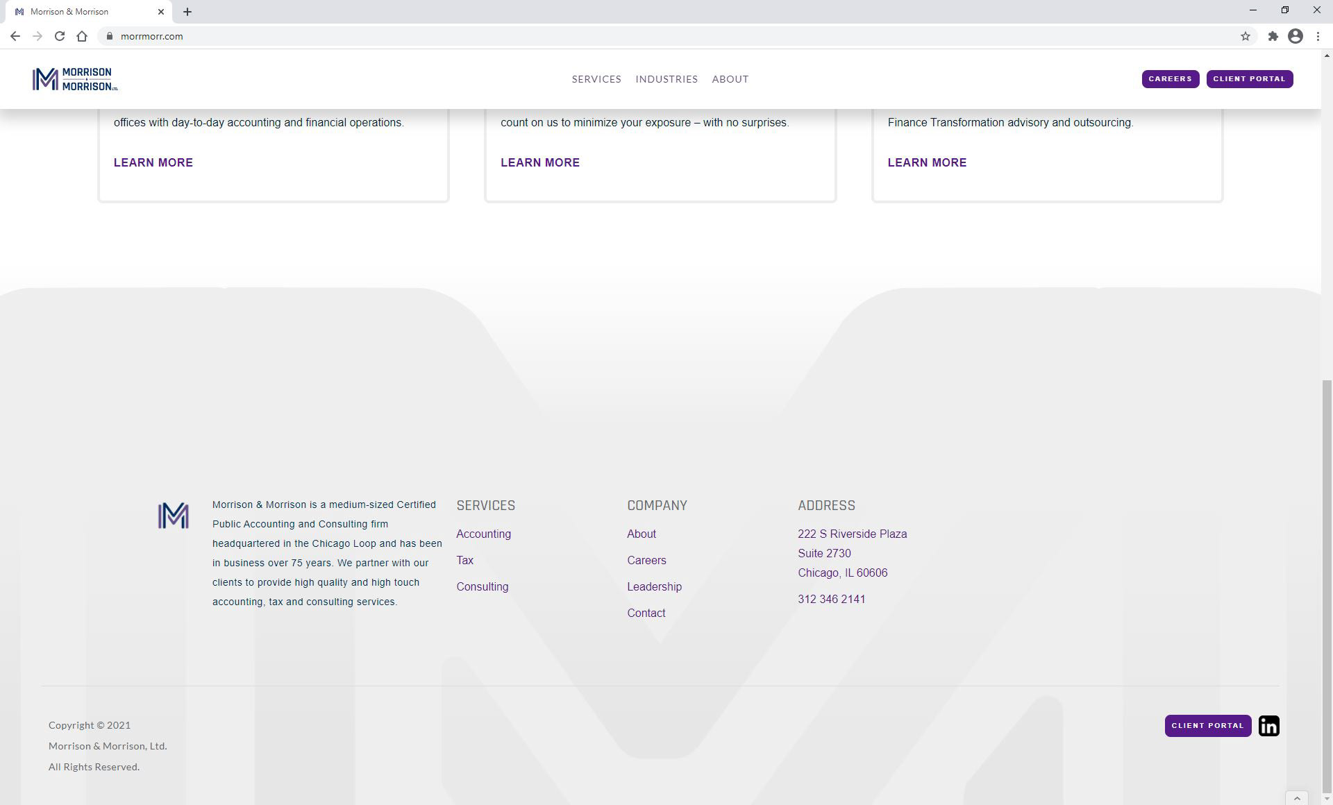
Footer
Key Takeaways
A lot of my user research testing was done by myself and after my Google Coursera UX Design Course, I have learned that it is best to run a series of UX research studies on both the the lo-fi and hi-fi prototypes to groups that fit the target audience.
Before Re-Design
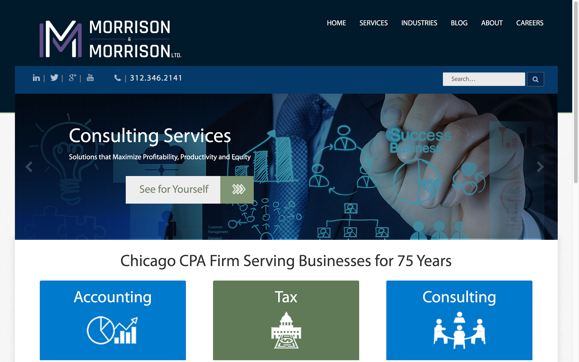
Home

Footer
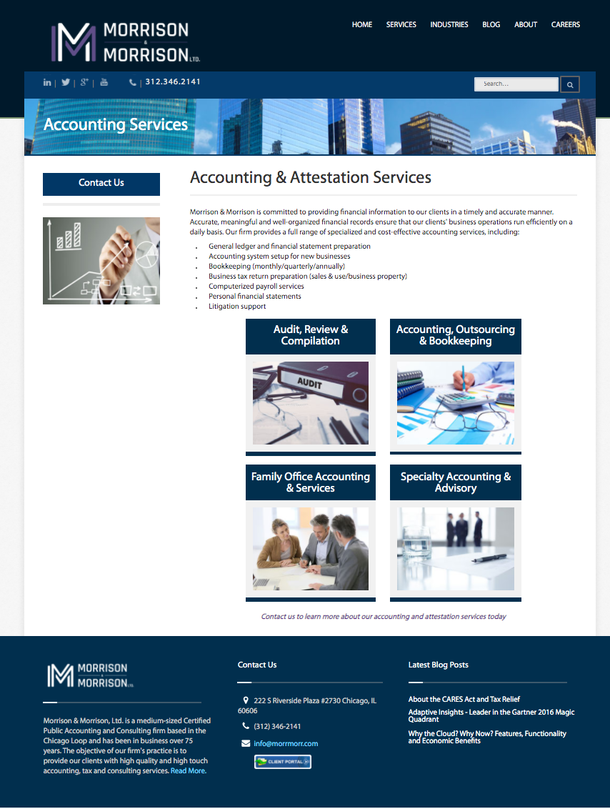
Services
